Color Scale and Palettes
Color Scale
The color scale is a method or function that maps the data values to a group of colors. It transforms a data value in a certain interval(domain) into a color in another color interval(range). Studio provides 3 predefined color scale (or data classification) methods for creating thematic maps:
- Quantize (Equal Interval)
- Quantile
- Jenks Natural Breaks
Users can also create a customized color scale using:
In cartography, a thematic map is a type of map that portrays the geographic pattern of a particular subject matter (theme) in a geographic area[1]. There are many different methods to create a thematic map including Choropleth map[2], Isarithmic/Isoline[3], Dot Denstiy map[4], Flow map[5] etc. Color scale or data classification methods can be used to separate the range of values into classes when creating a thematic map.
Quantize (Equal Interval)
Quantize (Equal Interval) scale divides the range of the continuous variable into equal interval bins. The data values are organized into these bins with different colors, which users can specify in color palettes. Quantize scale emphasizes the amount of a data value relative to other values, so it is best applied to data ranges like altitude, precipitation and temperature.
In the "Color Scale" selector, you can select the option "Quantize":
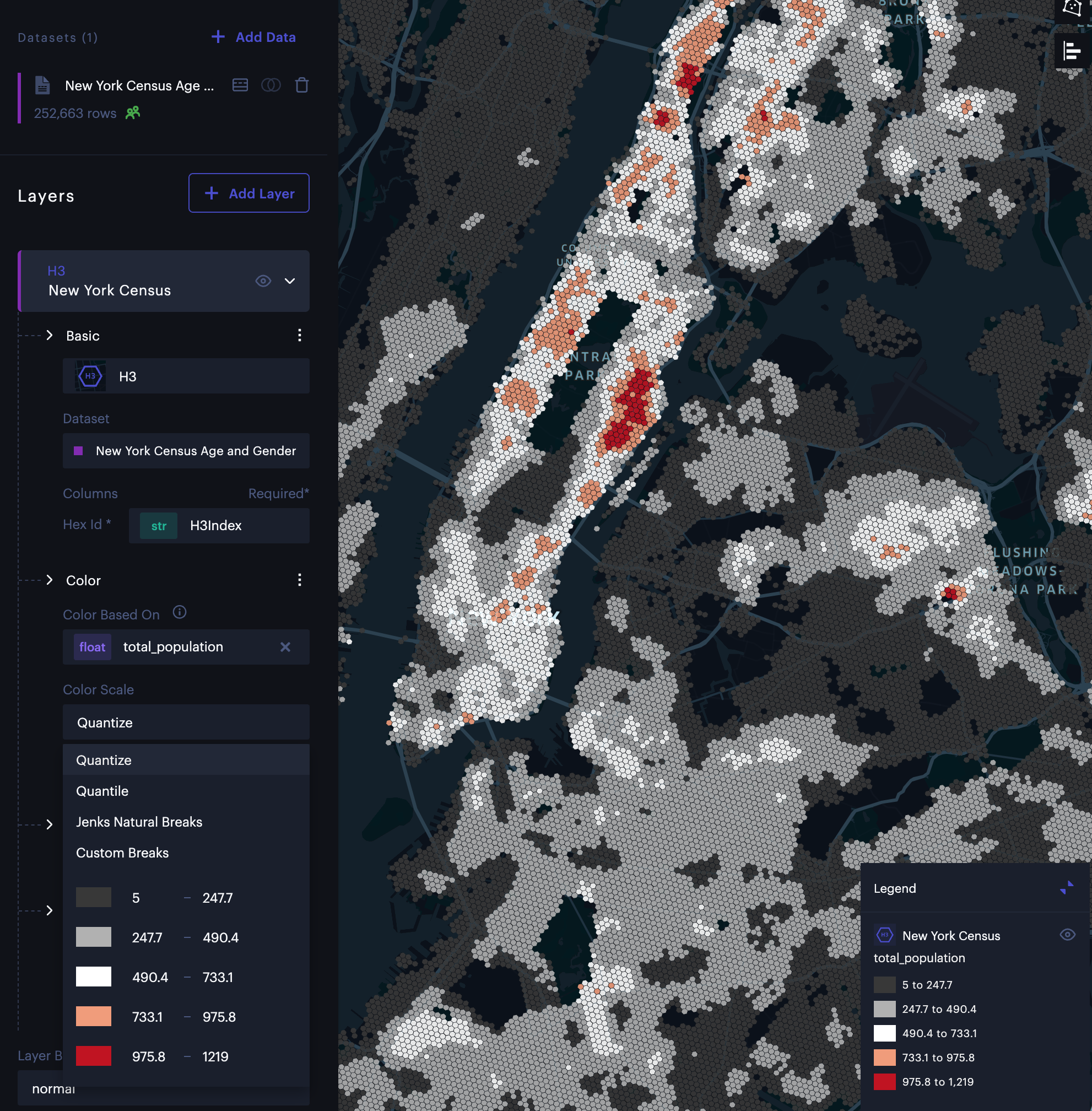
Quantize scale.
Quantile
Quantile scale organizes the data values by grouping them into bins that each have the same number of data values. This method is well suited to linearly distributed data since data values are grouped in equal numbers in each bin. The downside of this approach is that similar values could be placed in different bins, or very different values could be placed in the same bin. One can adjust the number of bins (steps) to minimize the impact of these issues.
The quantile with 4 bins is called "quartile". The quantile with 4 bins is called "quintile".
In the "Color Scale" selector, you can select the option "Quantile":
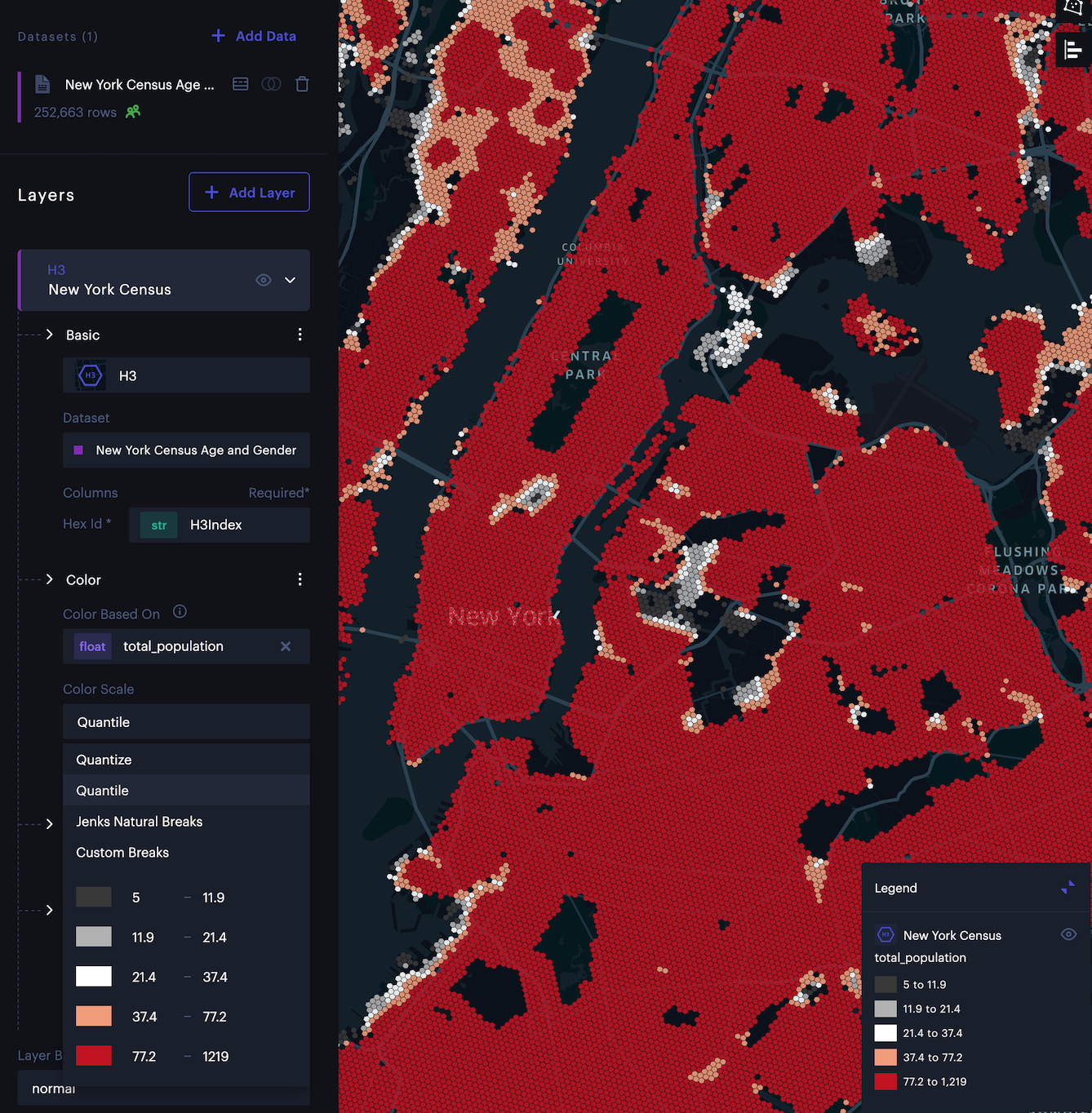
Quantile scale.
Jenks Natural Breaks
Jenks Natural Breaks is an optimization method that arranges the data values into different groups where the within-group homogeneity is maximized[6]. In essence, it is a clustering algorithm on one-dimensional data to find the best arrangement of data values into different groups. This approach minimizes the variation within each group, so the data within each group are as close as possible in value to each other.
In the "Color Scale" selector, you can select the option "Jenks Natural Breaks":
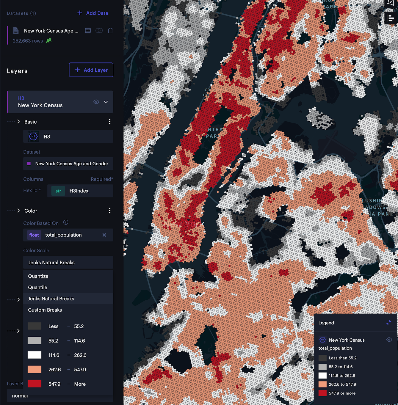
Jenks Natural Breaks scale.
Custom Breaks
Custom Breaks allows the users to specify color scales manually by editing the threshold values and the mapped color class. It also can be used as a tool to adjust the color scales from above methods. There are two major parts in custom breaks panel:
- Color Scale Histogram
- Custom Breaks Editor
Color Scale Histogram
The color scale histogram is used to represent the distribution of the selected data. In the histogram, the vertical dotted lines at each breakpoint of scale help users to understand how the break values divide the data into different groups. Users can drag and move the ticks to adjust the break values to create a customized color scale easily. The changes made in the histogram are linked with the custom break editor.
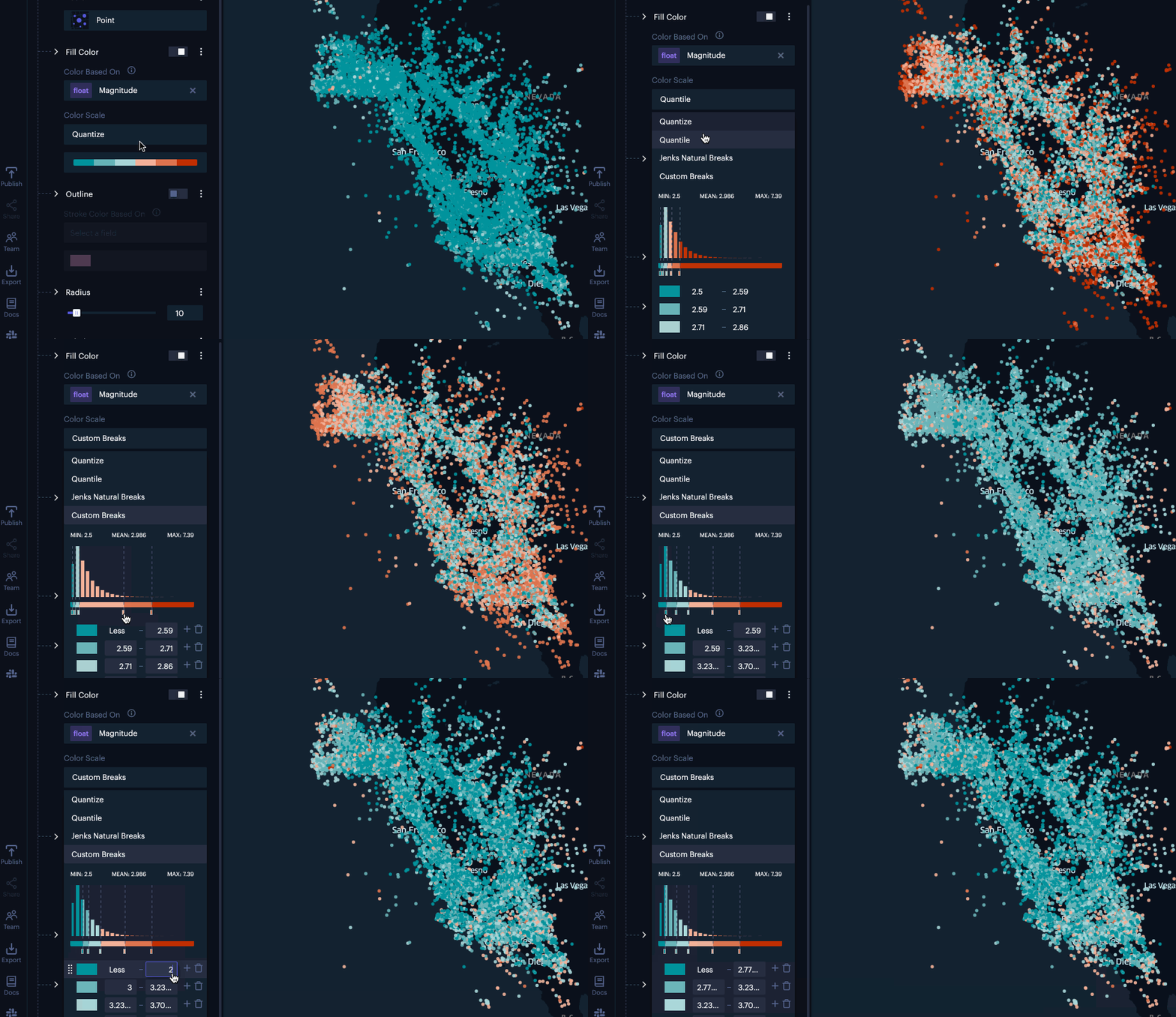
Color Scale Histogram
Custom Breaks Editor
The custom breaks can be edited to specify exact breaks and colors.
In color scale selector, users can select "Custom Breaks" option to enable custom breaks editing. Then, users can edit custom breaks and color in the custom breaks editor. To save the custom breaks, users can click the "Confirm" button. (See the left figure below).
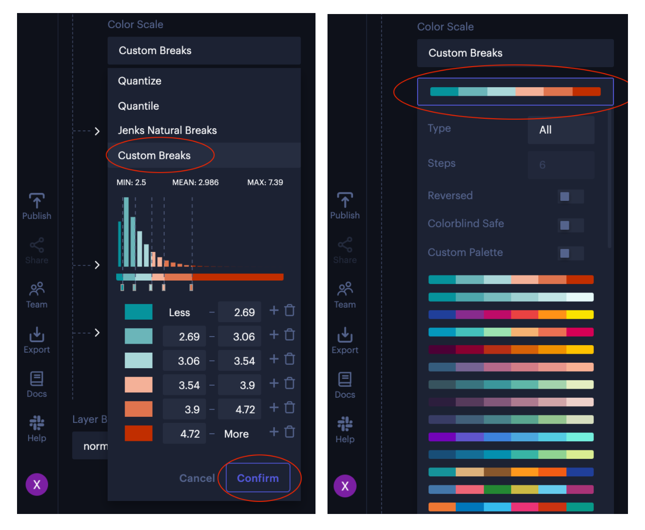
Edit Custom Breaks (left) Select Color Palette (right).
In the custom breaks editor, users can click on each color to pick a new color from the color picker. They can also change color steps (add, remove, or reorder).
To change a predefined color palette, users can click the "Confirm" button to save and close the custom palette editor. Then, click the "Custom Palette" and select one predefined color palette from the dropdown list. (See the right figure above).
When a custom color breaks option is chosen, change steps are disallowed. To change the steps, please enable custom breaks editing and change steps using the custom breaks editor.
Custom Color Scale for Categorical Data
Custom color scales are also available for categorical data (such as strings or ordinal values). With a categorical data type selected, select Custom Ordinal color scale.
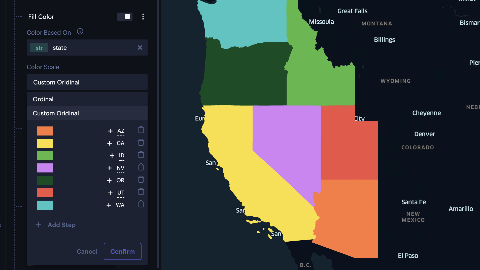
Custom color scale for US States.
Click the color beside a value to open the color hex editor. If you wish to add a new step, click + Add Value and select any number of values to represent with the color. Click Select the Rest to add all other values not currently represented by a color.
Color Palettes
A color palette refers to the set of colors that are used to represent values or categories of data in your visualization.
Studio has a large set of preset palettes specifically designed to provide an effective and visually meaningful representation of spatial data, separated into several categories:
| Category | Example | Description |
|---|---|---|
| Sequential |  | Used to represent data that has a natural progression or an ordered sequence. It is particularly useful for visualizing continuous data, where values increase or decrease progressively from one end to the other. |
| Qualitative |  | Used to represent data that falls into distinct categories or groups. Unlike sequential color scales that represent ordered or continuous data, qualitative color palettes are designed to differentiate discrete classes without implying any inherent order or magnitude between the categories. |
| Diverging |  | Used to represent data that has a critical midpoint or a natural break. This type of color scale is particularly effective for visualizing data that exhibits positive and negative deviations from a central value. |
| Cyclical |  | Used to represent data that has a cyclical or periodic nature. This type of color scale is designed to create a smooth transition of colors that cycle back to the starting color, forming a continuous loop. Particularly useful for visualizing data that represents periodic phenomena or circular quantities, such as angles, compass directions, time of day, etc. |
Custom Palettes
Users can create color palettes by clicking the Create New Palette button.
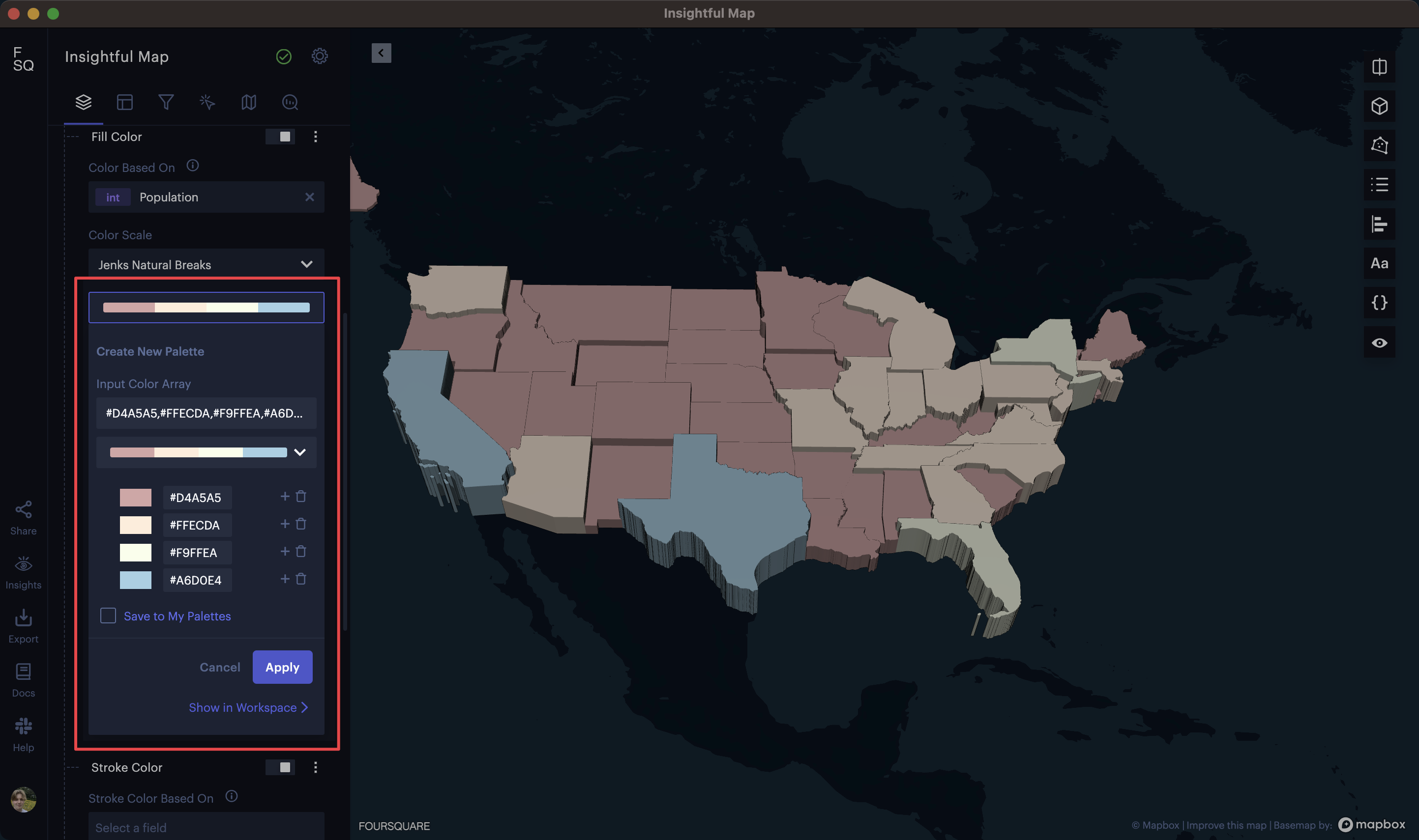
Creating a custom color palette in Studio.
Tip:Like a default color palette, but want to tweak it? Simply select it then click Create New Palette; you'll be able to alter it to your liking.
You can edit the color palette by clicking the + button, creating a new color step. The color steps can be reordered by clicking and dragging them into the desired position.
Alternatively, you can paste an array of hex color codes into the Input Color Array box. This can be useful if you have color scales in other programs, allowing you to import existing color scales into Studio.
Click Apply to update your layer with the custom color palette.
Color Palette Library
Pro users can save the custom color palettes to their accounts. Moreover, they can share these palettes with their teammates, enabling the creation of collaborative, on-brand visualizations.
To save a color palette, check the Save to My Palettes option. In the Palette Name text box, enter a name for your color palette, then click Save and Apply.
If you want to share this color palette with your team immediately, click Show in Workspace.
All palettes saved to your library can be accessed in the My Palettes section of the color scale settings.
Share Color Palettes
You can share color palettes with your team in the Workspace, under the Color Palettes section.
Simply select any palettes you wish to share, then click the Share button.
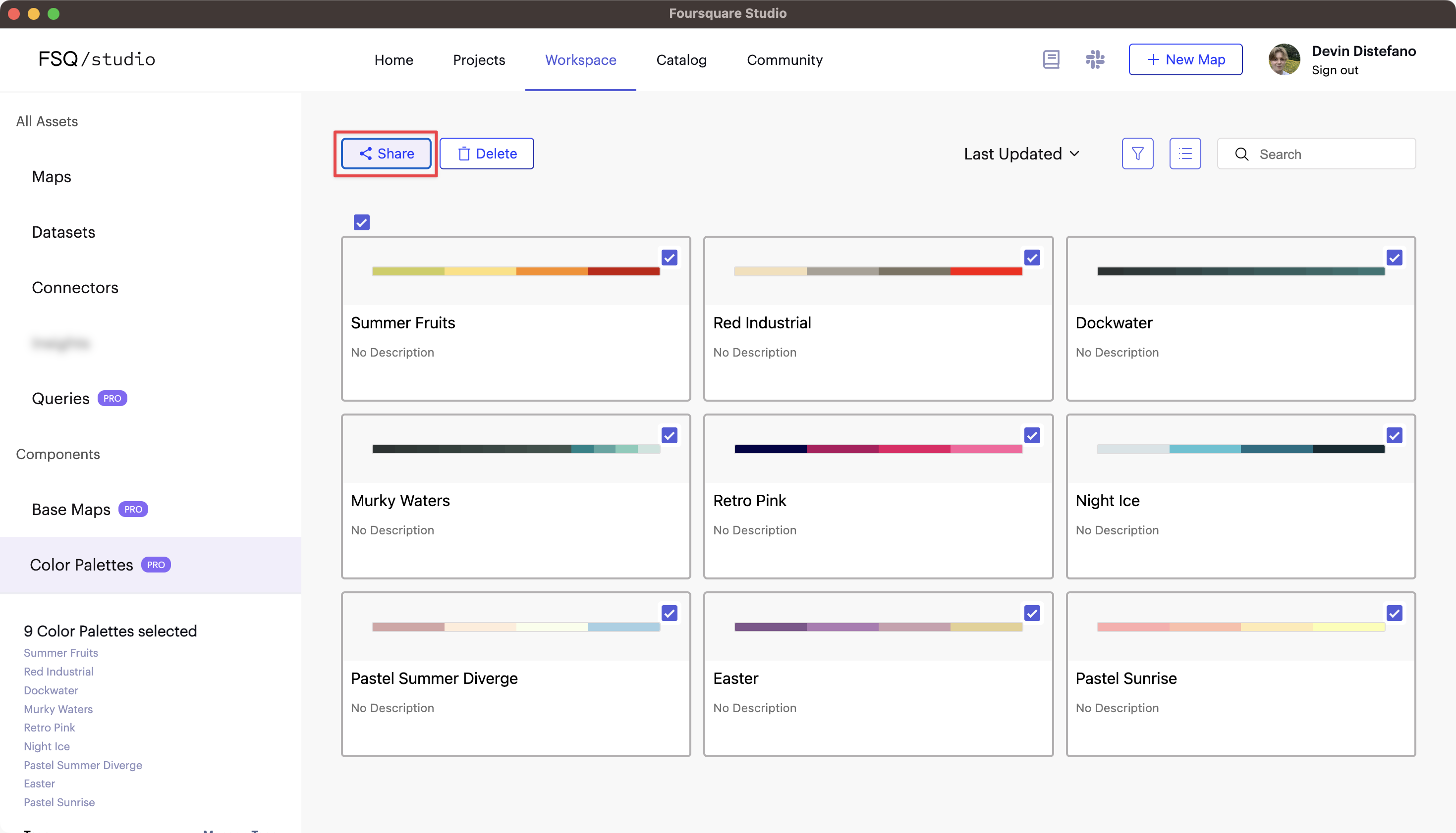
Selecting maps to share to the organization.
You can switch to your organization's tab to view all color palettes available in your organization.

Viewing color palettes saved to the organization.
All shared color palettes are available within Studio's color scale settings, under a section labeled [Organization Name] Palettes.
Note: Your own palettes appear in the My Palettes section, even if they are shared with your organization.
Updated 2 months ago

 Enterprise feature. Contact us to learn more.