
Line Chart
The line chart can be used to compare change in a set of variables over time. The line chart can be used to track several objects or entities over a period of time, allowing for a condensed analysis of your entire temporal dataset.
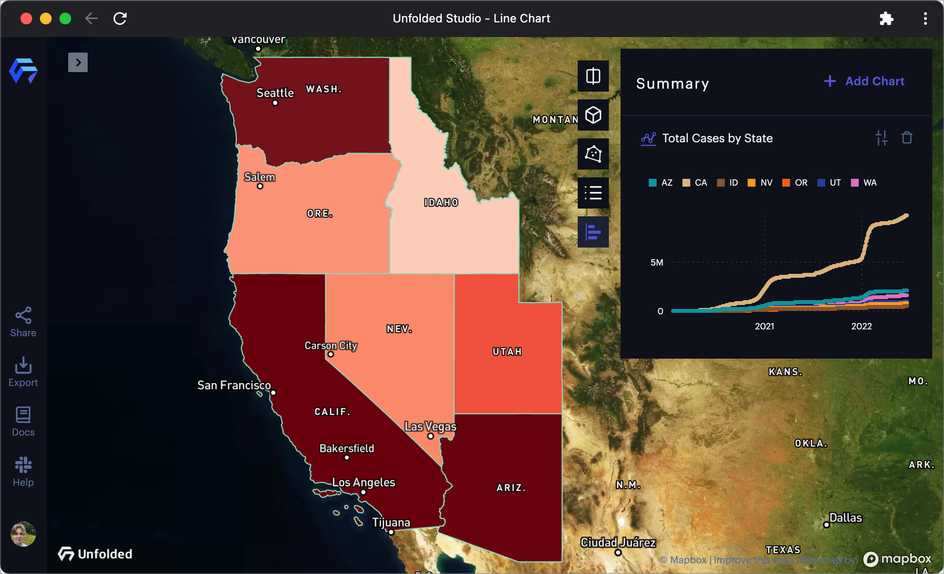
A Line Chart displaying Covid-19 infection data.
Follow these steps to create a Line Chart:
1. Click the Show Charts button on the top-right of the window.
2. Click Add Chart > Line Chart.
A settings panel will appear, allowing you to configure the line chart.
Base Settings
| Option | Description |
|---|---|
| Title | A title to use for the chart. |
| Dataset | The dataset containing the fields for the line chart. |
| Use Filtered Data | Enable to use filtered data on the line chart. |
X Axis
| Option | Description |
|---|---|
| X Axis | Field to use for the X Axis. Defaults to a time field. |
| Show Grid Line | Display vertical grid lines for the Y Axis ticks. |
| Interval | For temporal data, the time interval to use for X ticks. |
| Format Number | Apply formatting to values on the X Axis. Select from a list of supported formatting options. |
Y Axis
| Option | Description |
|---|---|
| Y Axis | Field to use the for Y Axis. Select an aggregation type on the right. Defaults to sum. |
| Title | String to use as a title along the Y axis. |
| Aggregation | Select from the supported aggregation options. |
| Show Grid Line | Display horizontal lines for the X Axis ticks. |
| Format Number | Apply formatting to values on the Y Axis. Select from a list of supported formatting options. |
Group By
| Option | Description |
|---|---|
| Group By | Field to use to create groups. |
| Benchmark | Group to use as a benchmark. Benchmarks appear as dotted lines. |
| Max Number of Groups | The maximum number of groups to display. |
| Group Others | Enable to group all other groups that are not included in "Max Number of Groups." |
| Sort By | Choose a method to sort groups. |
Color By
| Option | Description |
|---|---|
| Color By | Choose a method to color lines. |
| Color Range | The color range to use for the lines in the Line Chart. |
More Options
| Options | Description |
|---|---|
| Chart Hint | Add a hint for the chart. You can use expressions to design the parameterized hint. For more information, see chart hints. |
| Show Area | Enable to display a shaded area below each line. |
| Show Percentage Change | Enable to display the percentage change from the chart's start. |
| Show Axis Lines | Enable to show grid lines on the Y and X axis. |
| Show Legend | Enable to display a legend mapping the color scheme. |
| Legend checkboxes | Toggle on/off the visibility of individual line data series in the chart. |
Updated 5 months ago
Did this page help you?