
Horizontal Bar Chart
Horizontal Bar chart displays comparison of a categorical field with horizontally aligned bars. The vertical Y-axis represents the categories being compared, while the horizontal X-axis represents either count or an aggregated value based on another field. You can use these following options to configure your Horizontal Bar.
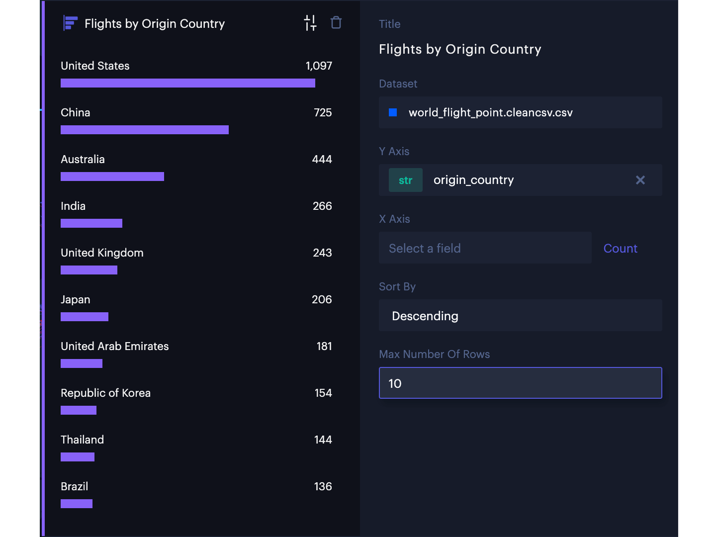
Horizontal Bar Chart
| Options | ||
|---|---|---|
| Title | Required | Title of the Chart. |
| Dataset | Required | Dataset of which the chart is depends on. |
| Y Axis | Required | The field you would like to compare. Only categorical field can be selected. |
| Sort By (Y Axis) | Choose from a list of sorting options for the Y Axis. | |
| X Axis | The field you would like to aggregate each bar. When field is not selected, the bar shows number of rows filtered. | |
| Aggregation | The method by which to aggregate data. | |
| Format Number | Select a formatting option for values on the X Axis. | |
| Group By | Select a field to group by. | |
| Max Number of Rows | Max number of grouped bars to display. | |
| Sort By | Choose a method by which to sort bars. | |
| Color | A color scheme to use for chart's bars. | |
| Color By | Choose a method by which to color bars. | |
| Use Filtered Data | Toggle to apply data filters to the chart. | |
| Show Legend | Enable to display a legend mapping the color scheme. | |
| Legend checkboxes | Toggle on/off the visibility of individual data series in the chart. |
Updated 5 months ago
Did this page help you?