Tooltip Chart
The Tooltip Chart displays metrics related to the selected layer in your mouse-over tooltip. Based on the layers present on the map, Studio will provide several charts types to select from.
Follow these steps to create a tooltip chart:
1. Click the Show Charts button on the top-right of the window.
2. Click Add Chart > Tooltip Chart.
You may select from a variety of charts based on the layers present in your visualization. To configure the chart, click Chart Settings.
Flow Layer Charts
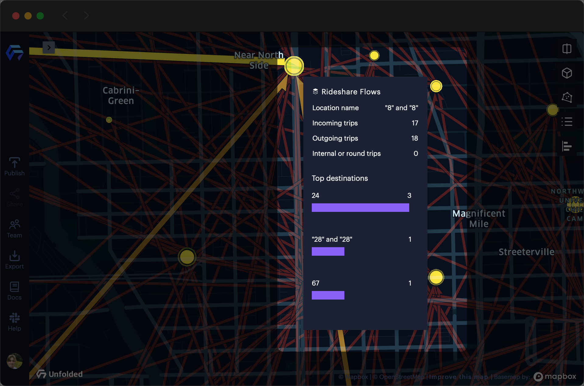
The Flow Layer currently supports the following Tooltip Chart types: "Top Origins" and "Top Destinations." These charts describe the top origins and destinations for any given cluster on the map.
The charts will update to the viewport when zooming to show the clustered locations for the current zoom level. The automatic clustering can be disabled in the layer configuration panel.
Using the Tooltip Chart with the Flow Layer, you can display chart metrics in the mouse-over tooltip. This allows users to interactively explore the top origins and destinations for any given point on the map.

Tooltip showing top destinations for a given Flow cluster.
Flow Layer Chart Options
| Option | Description |
|---|---|
| Custom Title | Title of the Tooltip Chart. |
| Layer | Layer to represent in the chart. |
| Field and Aggregation | The type of information to display (based on the layer selected). |
| Show in Tooltip | If enabled, displays chart metrics in the mouse-over tooltip. |
| Include Internal Flows | If enabled, includes internal flow data in the chart metrics. |
Category Breakdown Chart
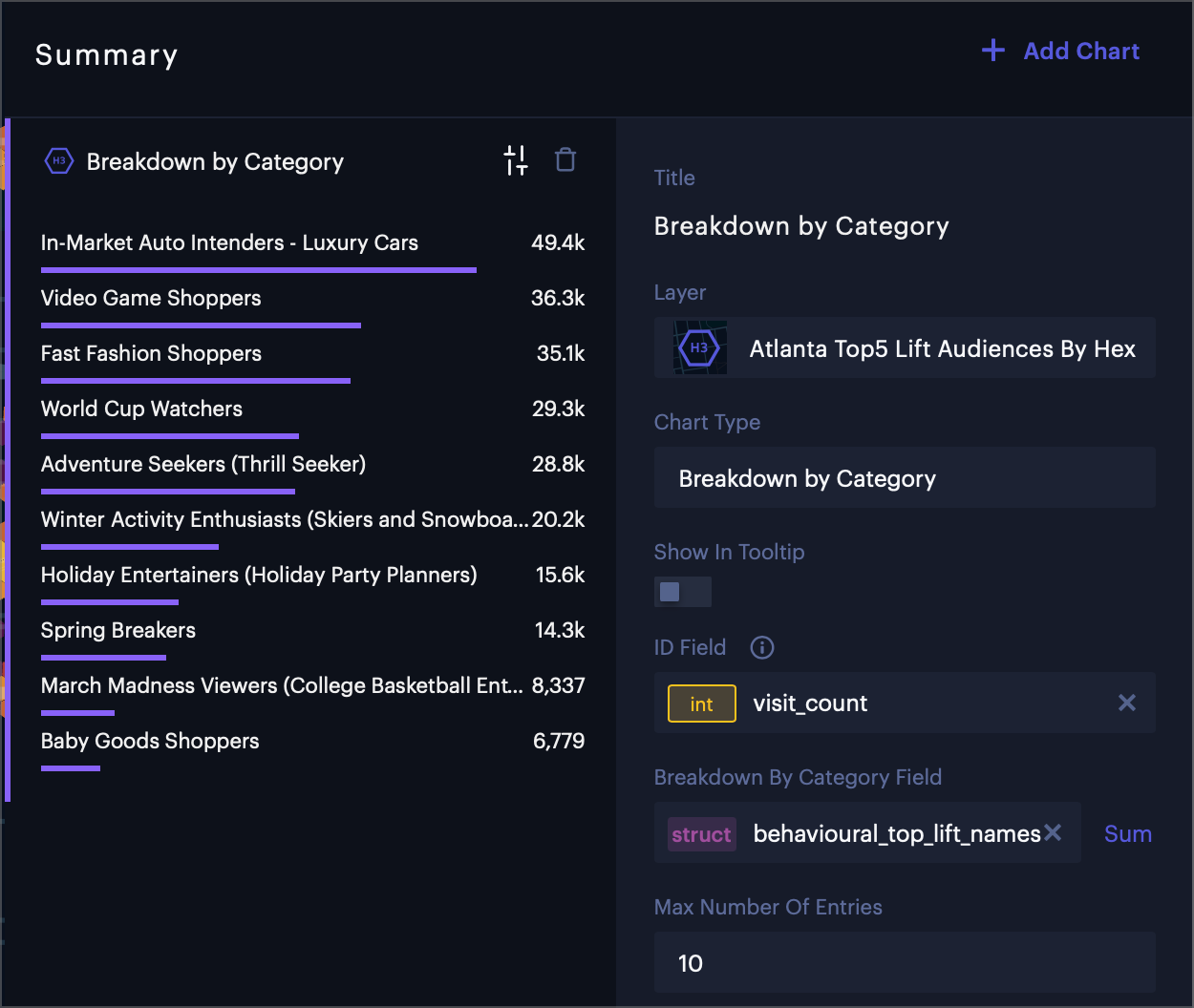
The Category Breakdown chart allows you to configure a visual ranking of the top categories in a given area.
By default, the Category Breakdown chart ranks all categories that exist in your current viewport. Alternatively, you can configure the chart to appear in a mouse-over tooltip, showing the top categories for a specific location on the map.

Category Breakdown chart showing advertising trends in Atlanta.
The Category Breakdown Chart requires your layer to reference a dataset containing a "struct" column with JSON objects mapping keys to numeric values. Learn more about formatting a struct object for use in Studio.
Category Breakdown Chart Options
| Option | Description |
|---|---|
| Custom Title | Title of the Tooltip Chart. |
| Layer | Layer to represent in the chart. |
| Chart Type | Type of Tooltip Chart to show. Must be Category Breakdown. |
| ID Field | Shown next to the chart when hovering over an element on the map. |
| Breakdown by Category Field | struct containing categorical data. Next to this option, select the mathematical operation used in categorization. Defaults to sum. |
| Format Categorical Breakdown Values | Apply formatting to categorical breakdown values. Can only be applied to numerical values. |
| Max Number of Entries | The maximum number of categories to display in the chart. Select ALL to include all entries. |
| Sort Order | The order to sort entries on the tooltip. Natural sorts entries by the order of keys in the struct, Category sorts entries by category in alphabetical order, and Value sorts the the entries by value. Toggle reverse to reverse the sorting order. |
Time Series Chart
The Time Series chart displays a series of data points ordered by time. This chart requires a layer with a time column.
By default, the Time Series chart displays information regarding all data points on the map. Hover over a data point on the map to view its data in the Time Series chart window.
Alternatively, you can configure the chart to appear in a mouse-over tooltip, showing a Time Series chart for a specific data point on the map.
Time Series Chart Options
| Option | Description |
|---|---|
| Custom Title | Title of the Tooltip Chart. |
| Layer | Layer to represent in the chart. |
| Chart Type | Type of Tooltip Chart to show. Must be Time Series. |
| Show in Tooltip | If enabled, displays chart metrics in the mouse-over tooltip. |
| ID | Shown next to the chart while hovering over an element on the map. |
| X Axis Field | Field to display on the X axis. Defaults to a time column. |
| Y Axis Field | Field to display on the Y axis. Choose an aggregation type on the right. Defaults to count. |
| Format Y Axis | Format values on the Y axis. |
| Color Options | Apply coloring to the Y axis. |
| Interval | The interval at which to display time on the X axis. |
Updated 3 months ago
