Geospatial Data Operations
Studio's numerous geospatial operations are designed to minimize time spent outside of the application.
This page contains a number of guides for conducting geospatial data operations in Foursquare Studio.
| Geospatial Data Operations | Description |
|---|---|
| Filter by Geometry | Filter a map to display only content that is located within the bounds of the selected geometries. |
| Geometry Centroid | Find the centroid of geometry objects. |
| Spatial Buffer | Create a geometry of a specified distance around a shape or a point. |
| Spatial Join | Join or combine attributes from one dataset to another based on their spatial relationship. |
| Spatial Merge/Dissolve | Merge several geometries into a single one, dissolving borders between shapes. |
Filter by Geometry
You can create filters that limit the map's scope, only showing the selected geometries.
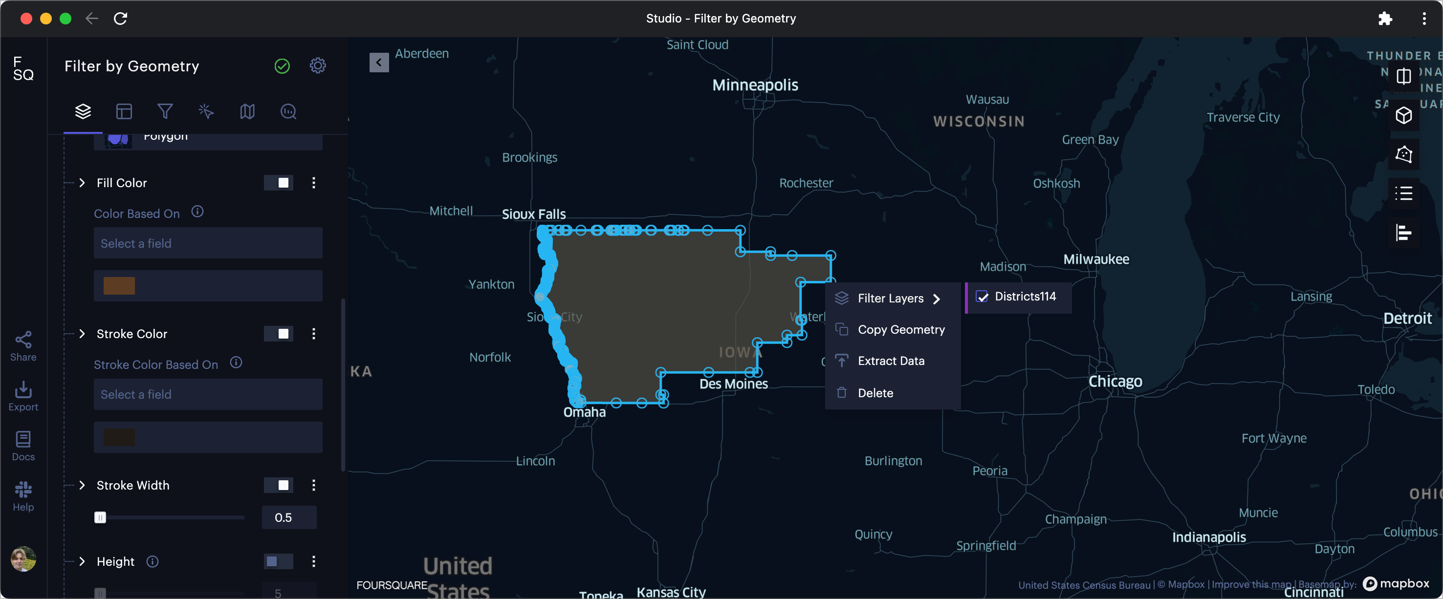
Filtering by a selected geometry.
Select a Boundary
To select a geometry on the map, click within its boundary, then click Select Geometry. Repeat this process for any additional geometries you wish to include in your selection.
Draw a Boundary
If you wish to specify an area to filter by, use the Draw tool to create a boundary. Drawing options include a rectangle or a custom polygon. Learn more about drawing boundaries.
Note: If you want to deselect a geometry, right-click the border of a selected geometry, then click Delete.
Enable Filter
To enable a filter, simply right-click your selection, move the mouse over Filter Layers, then select the layer you wish to filter on. All areas outside of the region will no longer be visible.
Geospatial filters and their settings can be found in the Filters tab. From the Filters tab, you can toggle the filter's visibility, or delete the filter.
Extract Filtered Data
One of the primary reasons to create geospatial filters is the extraction of data for a new dataset. This is often necessary to explore broad, national-scale datasets on a local level, optimizing color breaks for the area of study.
To do so, simply right-click the border of your selected geometry, then select Extract Data.
In the following menu, choose any columns you wish to include or exclude in the extracted dataset. Then, in the Extract Dataset window, select Filtered data extent, then optionally rename the dataset.
The extracted dataset will appear on a new layer. You may hide the original dataset to bring the extracted portion into view.
Example
In the above example, we have two datasets: Districts, a GeoJSON file containing MultiPolygon objects representing congressional districts, and Census 2020: Age, a publically-available census dataset available from our Data Catalog. This dataset has been enriched with Hex Tiles, scaling data-rich h3 cells as we zoom in and out.
When we run the extraction, a new layer appears visualizing the extracted dataset. Studio immediately adjusts the color scale to fit the area of focus. This map now shows age throughout the selected congressional district.
Geometry Centroid
Using the centroid() expression, you can generate points from the representative center of each input GeoJSON feature.
Example
In the below example, we will find the centroid of each Chicago neighborhood in our dataset.
First, navigate to the Columns tab in the left-hand sidebar, then click Add Column.
From the Add Column panel, simply call the centroid() function, passing your GeoJSON feature as an argument.
.
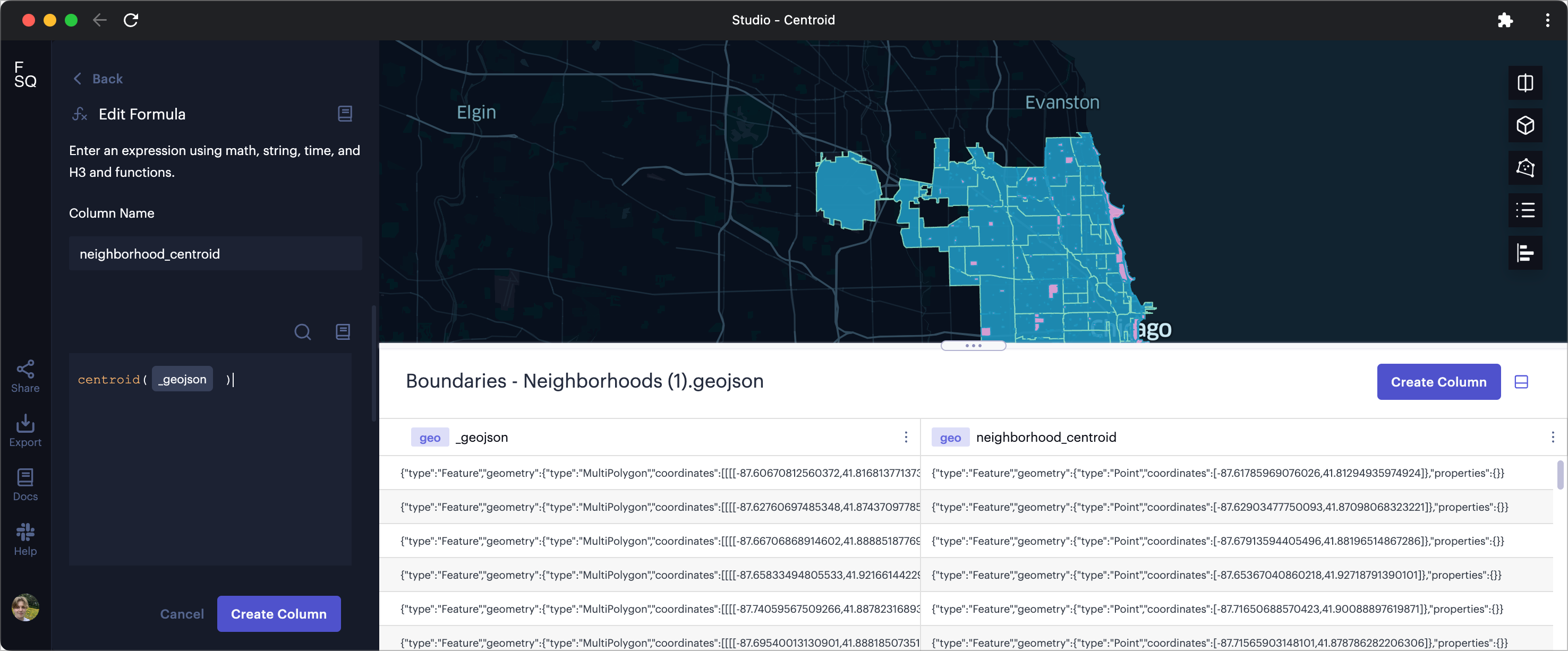
Generating centroids using expressions.
Click Create Column to add the centroid column to your dataset.
Visualize Centroids
To visualize centroids, navigate to the Layers tab. Then, select the layer of your choice.
You can use the Point Layer to show the centroid as a point. This is the most obvious choice for many use cases; a point's radius, color, and stroke can scaled by any value in your dataset.
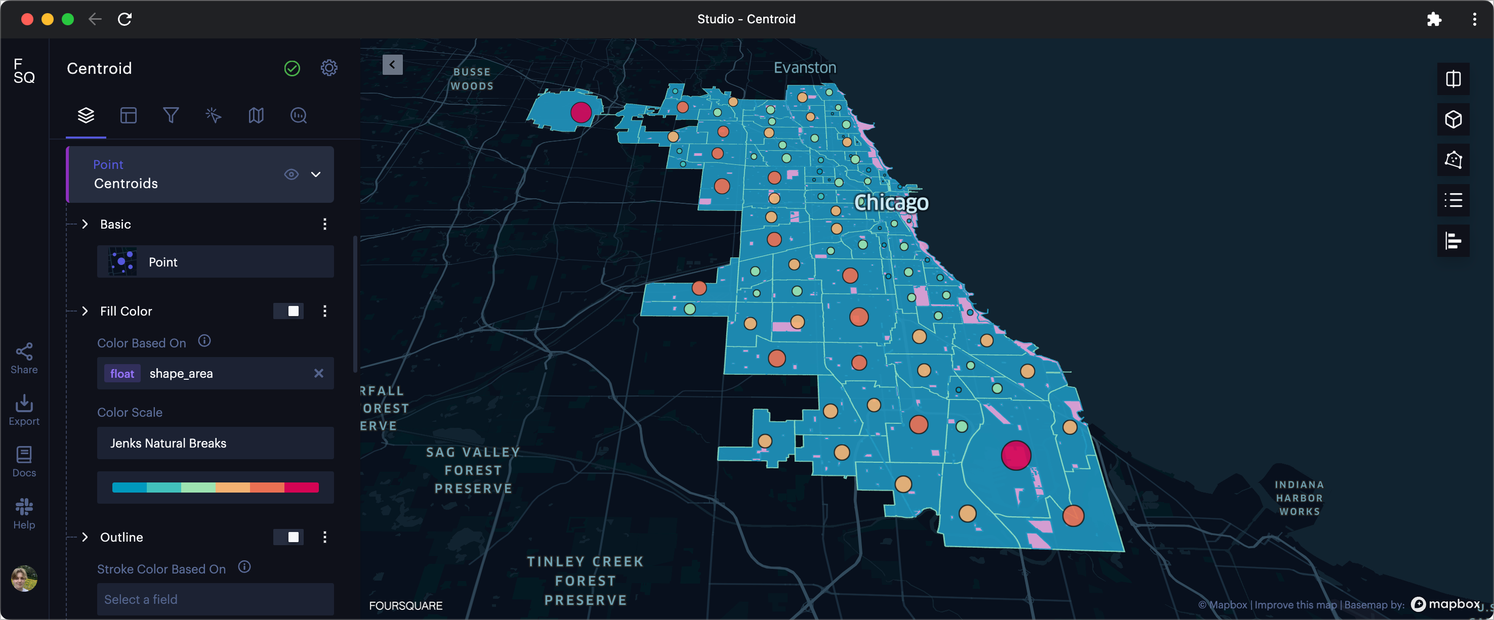
Visualizing centroids with radius and color scaled by boundary area.
Other layers capable of displaying points are the 3D Layer, where you can display a 3D object, the Icon Layer, where you can display an icon of your choice, and, if you have movement data between the polygons the centroids represent, the Flow Layer, Trip Layer, or Arc Layer.
Follow along in the next section to see how centroids can be utilized in the Spatial Buffer operation.
Spatial Buffer
You can use the buffer() expression to create buffer polygons surrounding each set of latitude/longitude coordinates.
You can also create buffers around GeoJSON features using bufferFeature(), or surrounding H3 cells using bufferH3().
Example
In the previous section, we created a GeoJSON point feature representing the centroid of each Chicago neighborhood. We have also included a new Parks - Chicago Park District dataset that shows each park in the Chicago city limits.
If we are interested in how many parks exist within 0.5 miles of a neighborhood's center point, we can start by creating a buffer surrounding the centroid.
First, navigate to the Columns tab in the left-hand sidebar, then click Add Column.
From the Add Column panel, simply call the bufferFeature() function, passing your GeoJSON point as an argument. Alternatively, if your point is represented by lat/lng columns, use the buffer() expression.
Then, create the buffer column. Parameters available include:
| Parameter | Type | Description |
|---|---|---|
feature | GeoJSON feature | Required. The name of the GeoJSON feature column to surround with buffer polygons. |
bufferDistance | number | Required. The length of the buffer from the edge of each feature. |
distanceUnit | string | The distance unit to use for the buffer, either Meter/Meters, or Mile/Miles (not case-sensitive). Default: Mile |
pointsPerArc | number | The number of points to create the rounded corner of the buffered shape. A higher number of points generates a smoother buffer corner. Default: 10 |
For our example, we will use the expression bufferFeature(_centroid , .5, "Miles", 10) to create our new _buffer column.
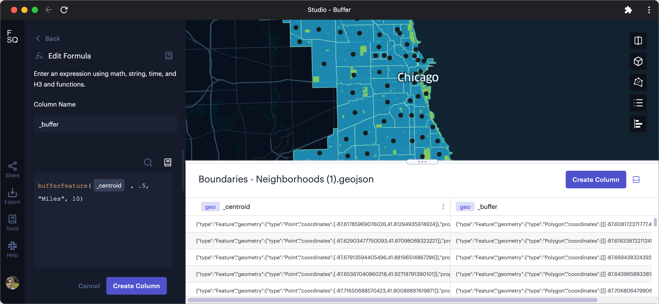
Creating a buffer surrounding neighborhood centroids.
To view the buffers on the map, navigate to the Layers tab, click Add New Layer, then create a new Polygon layer. Use your new buffer layer as the source to generate the polygons.
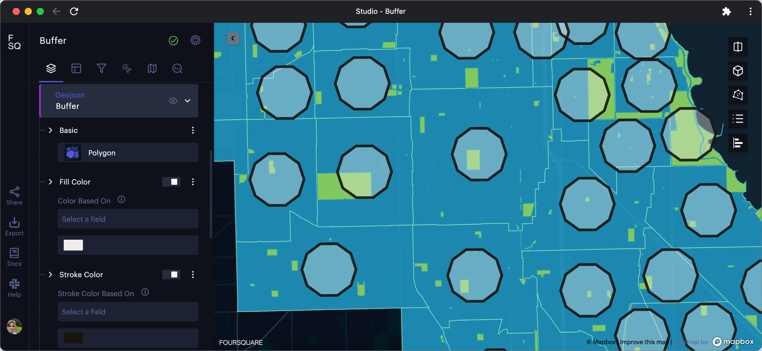
Buffers surrounding neighborhood centroids, visualized over a neighborhood and park polygons.
Creating this layer allows viewers to visually interpret which neighborhoods have parks that fall within half a mile of their geometric center.
However, we can introduce more detailed analytics to this project by conducting a Spatial Join. Follow along to the next section to see how we can conduct a spatial join on the Parks - Chicago Park District and the new _buffer features.
Spatial Join
Spatial join combines attributes from one dataset to another based on their spatial relationship. To perform spatial join, specify geometry columns in both datasets and select the type of spatial join you want to perform. Once the operation is complete, you will receive a new joined dataset.
On a dataset with a geometry column, click ⋮ More Options >> Spatial Join to open the spatial join configuration panel.
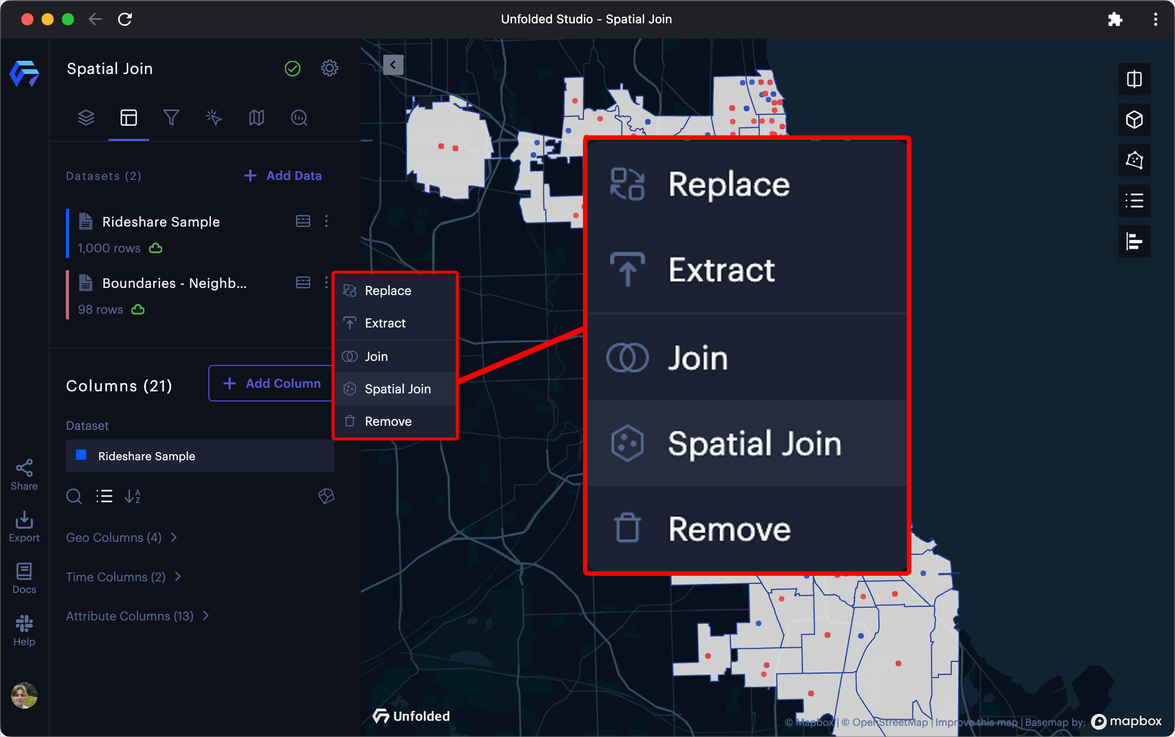
The Spatial Join button.
Learn more about configuring a Spatial Join.
Example
In this example, we will run a spatial join operation on Parks - Chicago Park District Park Boundaries (selecting the _geojson column) and Boundaries - Neighborhoods (selecting the _buffer column).
Select any columns to include in the spatial join along with an aggregation option, then click Run to generate spatial join results. If something does not look right, change any parameters then click Rerun.
In this case, we will include the acres column, aggregating by sum. Since we are interested in the amount of parkland within 0.5 miles of the neighborhoods, we will use the Overlap spatial join operation.
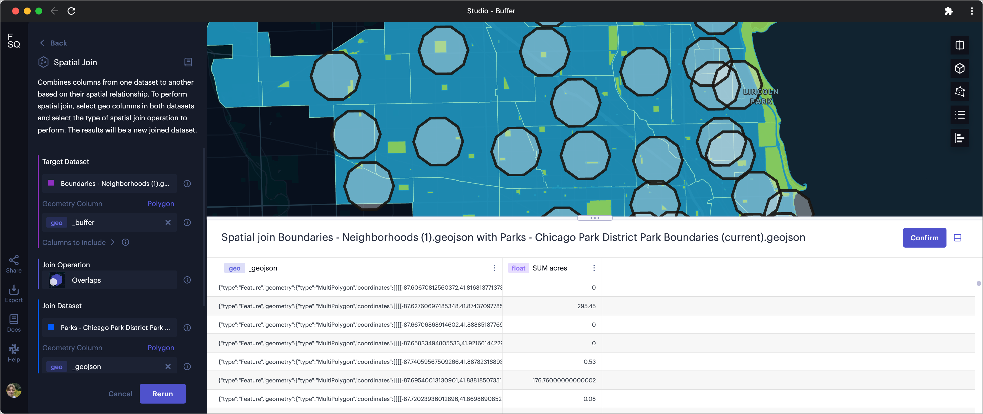
Conducting a spatial join operation between Chicago neighborhood centroids and parkland.
Once the results look good, click Confirm.
Visualizing Spatial Joins
Upon completing the spatial join, a new Polygon layer may appear showing any GeoJSON features included in the join.
Using the neighborhood polygon boundaries, we can use the aggregated sum - acres column to visualize how much parkland is available within a 0.5-mile radius of a neighborhood's centroid.
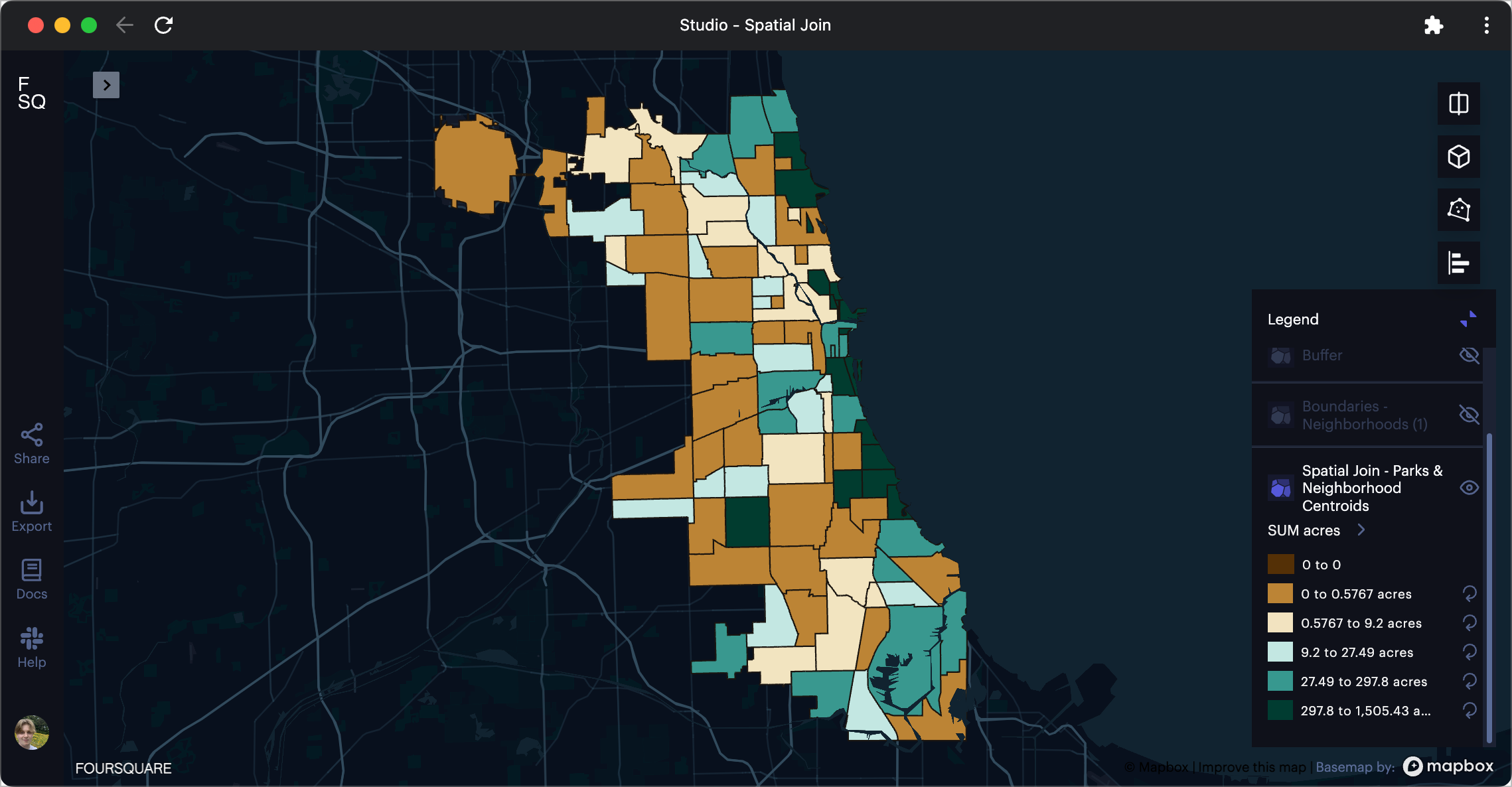
Chicago neighborhoods colored by centroid park acreage.
Spatial Merge (Spatial Dissolve)
Use spatial merge with geojson or h3 data to dissolve borders or otherwise combine geometries based on a common field. When merging geojson data, all polygons, LineStrings, Points, and other features will be merged. When merging h3 data, all h3 indexes that share the field will be merged.
Follow these steps to complete a spatial merge:
- Start a new group by operation, then select a field shared by the geometries you wish to merge.
- Choose any other columns you wish to include in the group-by operation.
- Select the
Mergeaggregation option for yourpolygonorh3column.
Upon completing the group by operation, a new dataset will appear with your merged spatial objects.
Example
In the above example, a dataset containing election data is loaded into Studio. This election data has the column _geojson, which contains GeoJSON MultiPolygon objects representing congressional districts, as well as a column PARTY_LEADING, indicating which party controls the congressional district.
To view the number of congressional districts controlled by an individual party, we run a group by operation on the STATENAME field. Then, we choose the Merge aggregation option on our _geojson column and Mode on our PARTY_LEADING column.
Upon completing the merge, a new layer is automatically generated with the new Merge _geojson column. We can quickly configure this layer to display the data calculated by the group by operation. In this case, we alter the color scale to have just two steps, then select the new Mode PARTY_LEADING column to fill the polygons. This map now shows the party that controls the most congressional districts in each US state.
Updated 2 months ago
