
Spatial Workbench
FSQ Spatial Workbench provides a SQL-first approach to geospatial analysis, designed for BI analysts who want to transform business data into spatial insights through familiar query workflows. This guide will walk you through the essential steps to get started with the platform, from data upload to creating compelling dashboards and interactive maps.
Key Components
FSQ Spatial Workbench is built around several interconnected components that facilitate a streamlined data analysis workflow:
- Data Repository: The central storage hub where all your spatial datasets are managed. Whether you upload CSV files, GeoJSON, or other spatial data formats, the Data Repository ensures your data is organized, accessible, and ready for analysis across all platform features.
- Datasets: Individual data files or collections that serve as the foundation for your spatial analysis. Datasets can include various spatial data formats and are enhanced through the platform's data management capabilities, including column creation and filtering.
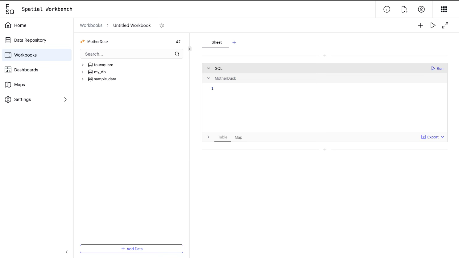
- Workbooks: Workbooks are your interactive workspace for data exploration and transformation, and typically where your analysis begins. Here, you can write and execute a series of SQL queries that run on the database, view results in tabular form, and get immediate geographical previews on a map. Workbooks are where you prepare your data for deeper analysis.
- Maps: Powered by Kepler.gl, Maps are dedicated visualization canvases for geographical data. They provide the same comprehensive mapping capabilities available in FSQ Spatial Studio, allowing you to plot data points, visualize density through heatmaps or clusters, and apply geographical filters to uncover location-based insights. Within Maps, you can work with:
- Layers: Individual data representations that can be customized independently. Each dataset becomes a layer that can be styled, filtered, and configured with different visualization properties such as fill color, radius, and layer type.
- Charts: Instantly interact and communicate the data on the map with dynamic bar, line and number elements.
- Analysis Tools: Built-in capabilities for data transformation, filtering, and spatial analysis including column creation, geographic filtering through drawing tools, and interactive selection mechanisms.
- Dashboards: Dashboards are interactive, shareable canvases where you can bring together multiple charts, maps, and text elements to tell a comprehensive data story. They provide a high-level overview of your insights and are ideal for presentations and monitoring key metrics. Dashboards are typically the final output of your analysis.
Onboarding
Upon your first use, you'll go through a quick onboarding process where you can select your preferred compute engine. Currently, MotherDuck is available as the default option (with more options coming soon), ensuring your data processing is efficient and scalable. This pre-provisioned environment comes loaded with Foursquare geospatial datasets, allowing you to immediately begin enriching your business data with spatial context. The following are the geospatial datasets that come pre-packaged with the workbench:
- FSQ OS Places & Categories: A comprehensive dataset containing information about various points of interest (POIs) globally.
- FSQ H3 Catalog: A collection of datasets leveraging the H3 hierarchical geospatial indexing system, useful for aggregating and analyzing geographical data at different resolutions. All derived from the source data which may be vector or raster. Learn more [here]
Storage & Compute Capabilities
FSQ Spatial Workbench offers robust storage and compute capabilities to support your analysis:
- Data Repository Storage: The Data Repository provides 5 GB of dedicated storage for your uploaded files, ensuring ample space for your datasets.
- **Database Storage & Compute:**Your database storage and compute resources are optimized and scaled according to the compute engine instance you select during the onboarding process, providing performance tailored to your needs.
Typical Workflow
FSQ Spatial Workbench follows a logical progression that mirrors how data analysts typically work. You begin by uploading and exploring your data, then use SQL to clean and combine datasets, visualize results through maps and charts, and finally create shareable dashboards that tell your data story. This interconnected system ensures a fluid transition from raw data to actionable insights and shareable reports..
-
Starting Your Analysis with a Workbook
To begin your analysis, you'll first create or open a Workbook:
- From the main FSQ Spatial Workbench interface, navigate to the Workbooks section.
- Click on the option to create a new Workbook or select an existing one to continue your analysis.
-
Uploading Your Data
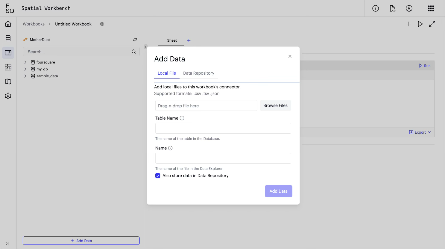
To begin, you need to import your data into the platform:
- Download some data e.g. walmart openings via: https://observablehq.com/@d3/walmarts-growth
- Click on the "+ Add Data" option in the left-hand panel.
- A file explorer window will appear. Navigate to the location of your data file (e.g., walmart.csv).
- Drag and drop your file into the designated "Click, or drap-n-drop data files here" area or use the "Browse Files" button to select it.
- The "Add Data" dialog box will appear. Confirm the file name and ensure "Add Data to Data Repository" is checked if you wish to add it to your Data Repository for future use.
- Click "Add Data". A confirmation message "The data has been uploaded." will appear, along with a SELECT statement in a new SQL cell.
- Close the "Add Data" dialog..
-
Querying Your Data

Leverage SQL to explore and analyze your uploaded datasets:
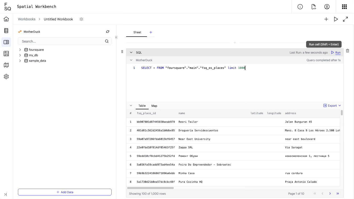
- After uploading, a new SQL cell will automatically be created with a basic SELECT statement.
- To run the query, click "Run" in the top right corner of the SQL cell.
- The query results will be displayed in a table below the SQL cell.
- To see a map visualization of your data (if it contains geographical information), click on the "Map" tab below the table.
-
Combining Datasets
Enhance your analysis by combining multiple datasets using SQL joins to create richer insights:
- Click the "+" button in the top right corner of the main workspace to "Add a cell".
- Select "SQL Cell" from the options.
- In the new SQL cell, write your SQL query to join datasets. For example, to join main.walmart.csv with foursquare.fsq_os_places:
SELECT a.*, b.name FROM my_db.main.walmart_csv a LEFT JOIN foursquare.fsq_os_places b ON MD5(CONCAT(CAST(ROUND(a.lat, 2) AS STRING), CAST(ROUND(a.lon, 2) AS STRING))) = b.g_hash_id - Click "Run" to execute the query. The results will be displayed in the "Table" and "Map" views.
-
Sending Data to a Map
Transfer your query results to dedicated map visualizations for further exploration.
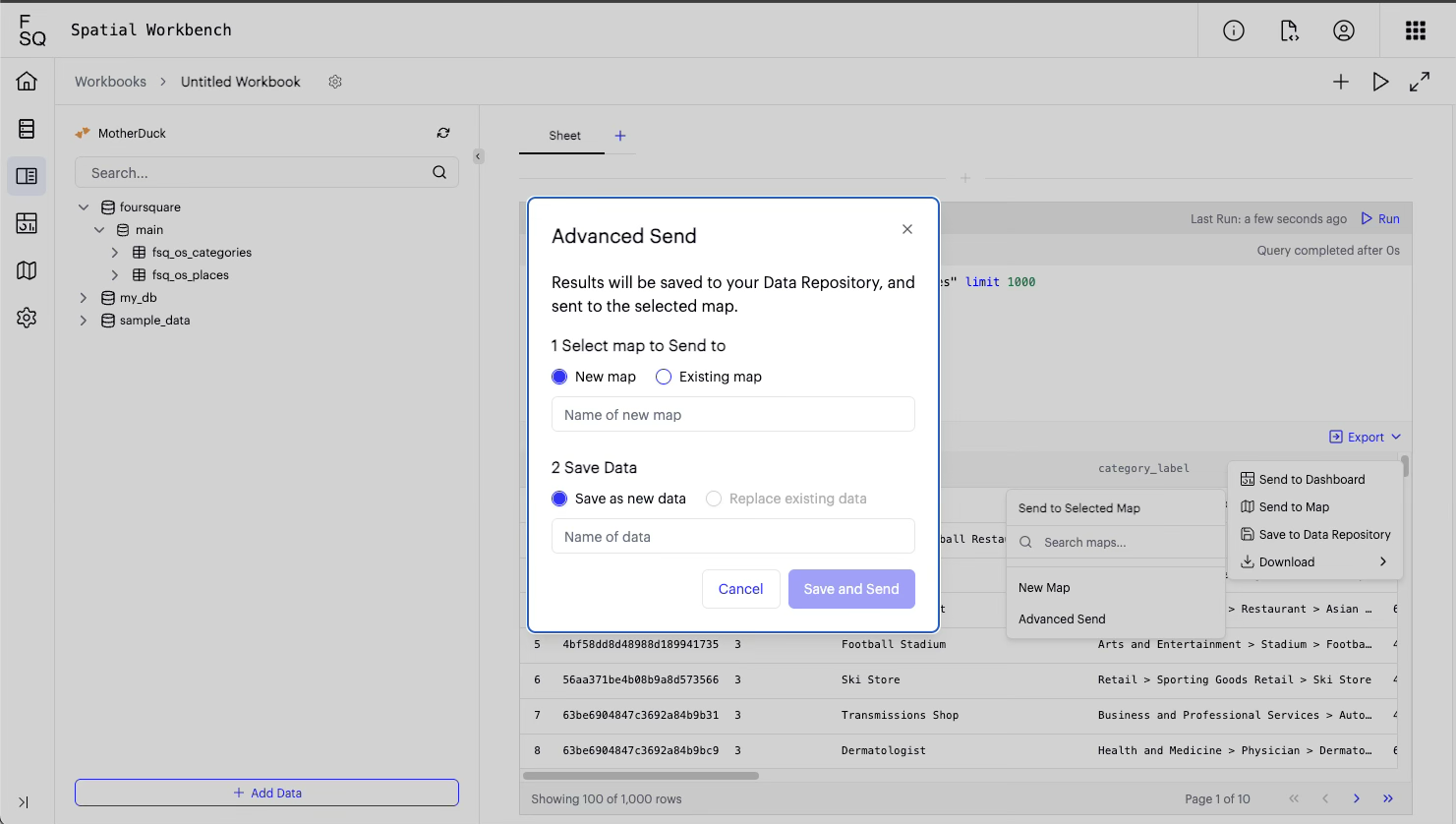
- After running a query and viewing the results in the "Map" tab, click the "Export" button (next to "Table" and "Map").
- Select "Send to new map" from the dropdown menu.
- A dialog box "Send to new map" will appear. Enter a name for your new map (e.g., "Walmart").
- Click "Save". A confirmation message "Dataset saved and sent to new map" will appear.
-
Customizing Your Map Visualization
Enhance your spatial insights through comprehensive map customization and styling. FSQ Spatial Workbench provides the full range of mapping capabilities available in FSQ Spatial Studio, enabling advanced visualization and interaction options.
Steps:- Your new map will load, displaying the data transferred from the workbook.
- In the "Layers" panel on the left, you can change the visualization type. For example:
- To see a cluster map, select "Cluster" from the available options.
- To see a heatmap, select "Heatmap". Adjust the radius and intensity as needed.
- To apply filters to your data:
- Click on the "Filters" tab in the left panel.
- Click "Add Filter".
- Select the field you want to filter by (e.g., "region").
- Enter the values to filter by (e.g., "AL", "AR"). The map will update to show only the filtered data, and a summary will appear on the right showing the count of filtered rows.
-
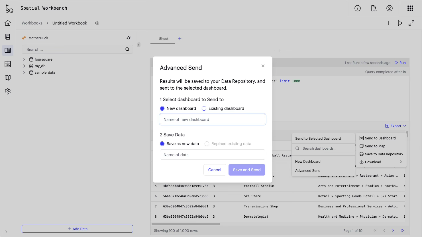
Creating a New Dashboard
Combine multiple visualizations and analytical outputs into comprehensive presentation dashboards.
- From the workbook (where you have your SQL cells and map), click the "Export" button (next to "Table" and "Map").
- Select "Send to new dashboard".
- A dialog box "Send to new dashboard" will appear. Enter a name for your new dashboard (e.g., "Walmart").
- Click "Save". Your new dashboard will load.
-
Adding Charts To Your Dashboard
You can add various types of charts to your dashboard to present different aspects of your data.
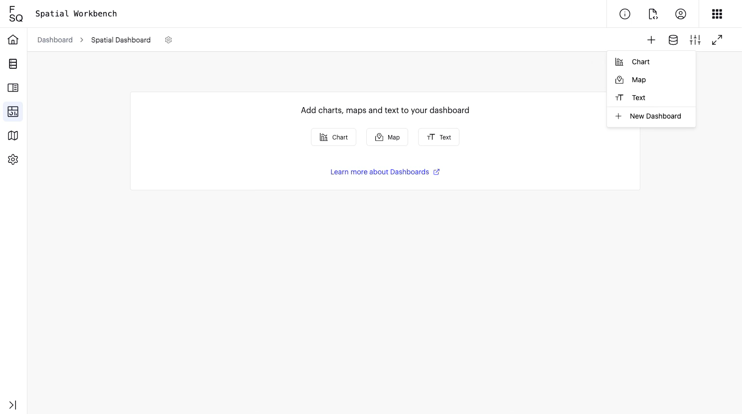
Steps for adding a bar chart:
- In the dashboard, click "Add Block" and select "Chart".
- Click "Edit Chart".
- Under "Chart Type", select "Bar Chart".
- For the "Dataset", ensure "UploadandCombine_SQL2..." is selected.
- For "X Axis", select the field you want to group by (e.g., "locality").
- For "Group By", select another field to stack the bars (e.g., "name").
- Add a title to your chart (e.g., "Store matches").
- Click "Back to Dashboard" to see your chart.
Steps for adding a line chart:
- In the dashboard, click "Add Block" and select "Chart".
- Click "Edit Chart".
- Under "Chart Type", select "Line Chart".
- For the "Dataset", ensure "UploadandCombine_SQL2..." is selected.
- For "X Axis", select a time-based field (e.g., "dt").
- For "Y Axis", select a numerical field (e.g., "postcode").
- Click "Back to Dashboard".
You can arrange and resize the charts on your dashboard as needed.
-
Publishing Your Maps
Once your map is complete, you can publish it to create a publicly accessible, shareable version. This feature generates a unique URL that you can send to others, allowing them to view your map in a web browser without needing access to your Spatial Workbench account.
Steps:
-
From your map view, click the Publish icon in the top-right corner of the interface.

-
In the "Publish Map" window that appears, click the Publish button.
-
Configure the settings for your public map in the "Publish Map" dialog:
-
Map Title & Description: Provide a title and description that will be visible to your audience.
-
Advanced Map Settings: Control which interface elements are available on the public map. For each element (Side information, Legend, Draw on Map, Charts), you can choose:
- Visible: The panel is shown by default.
- Collapsed: The panel is hidden by default but can be expanded by the viewer.
- Hidden: The panel is completely removed from the public map view.
-
Password Protection: To restrict access, check the box for Protect this map with a password and set a password.
-
-
Click the final Publish button. The system will process and publish your map.
-
A "Public URL" will be provided. Click Copy to copy the link and share it.
Viewing a Published Map
When a user navigates to the public URL:
- If the map is password-protected, they will be prompted to enter the password before they can view the content. An incorrect password will deny access.
- After successful authentication (or if no password is set), the map will load with the data and interface elements as you configured them.
Updating or Unpublishing
You can manage your published map from the same Share window:
- Unpublish: Deactivates the public link, making the map private again.
- Republish: Allows you to change any of the publish settings (e.g., title, UI controls, or password) and update the live map.
Find more in detail here: https://docs.foursquare.com/analytics-products/docs/publish
Updated 5 months ago